Indigo:
Mobile Website
The Problem
Indigo sees significant losses in traffic on its mobile website. With a fully responsive update pending, an improved mobile-specific site is needed in the interim.
The Objective
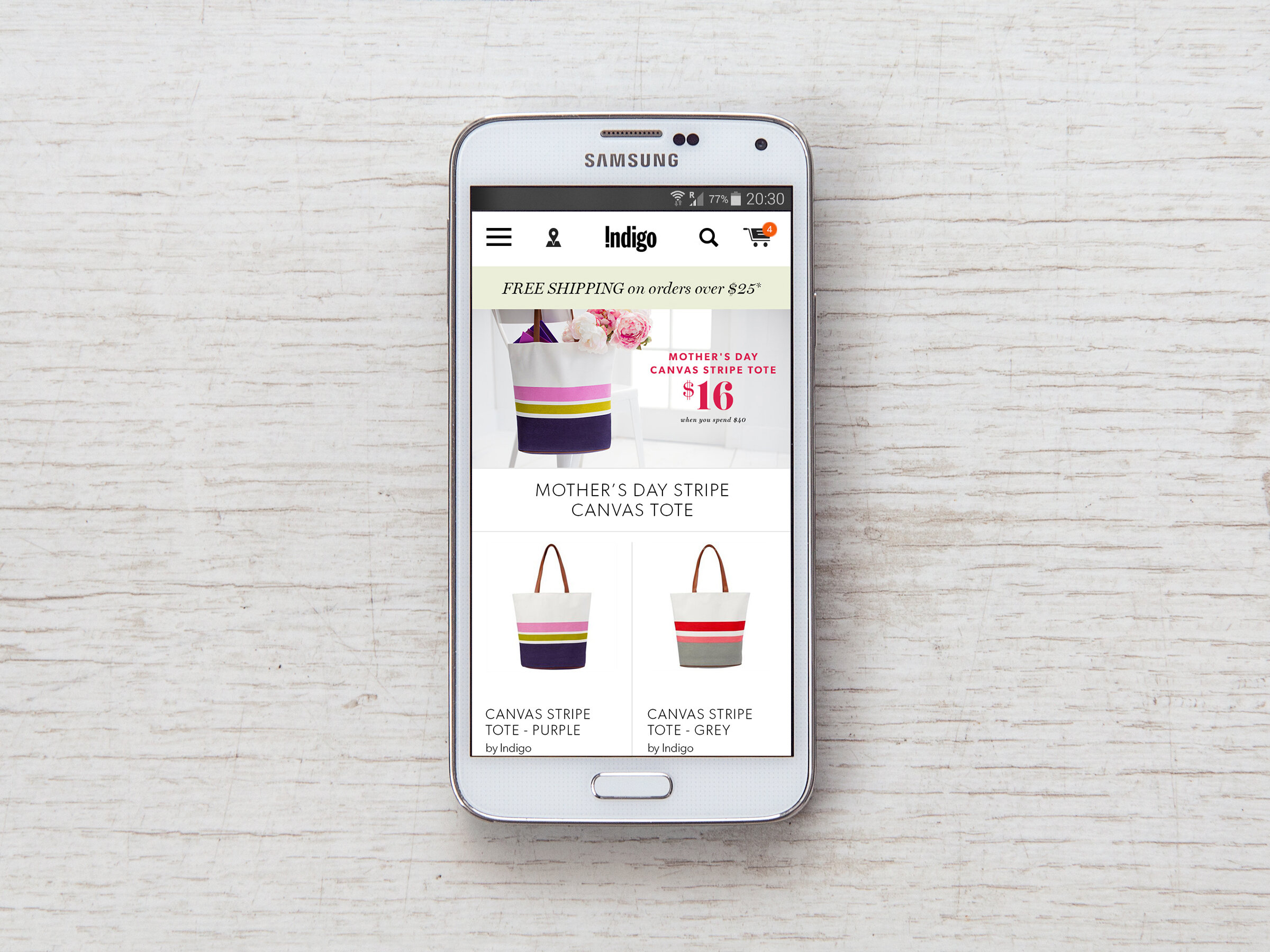
Develop a mobile site experience consistent with Indigo’s popular desktop version.
The Solution
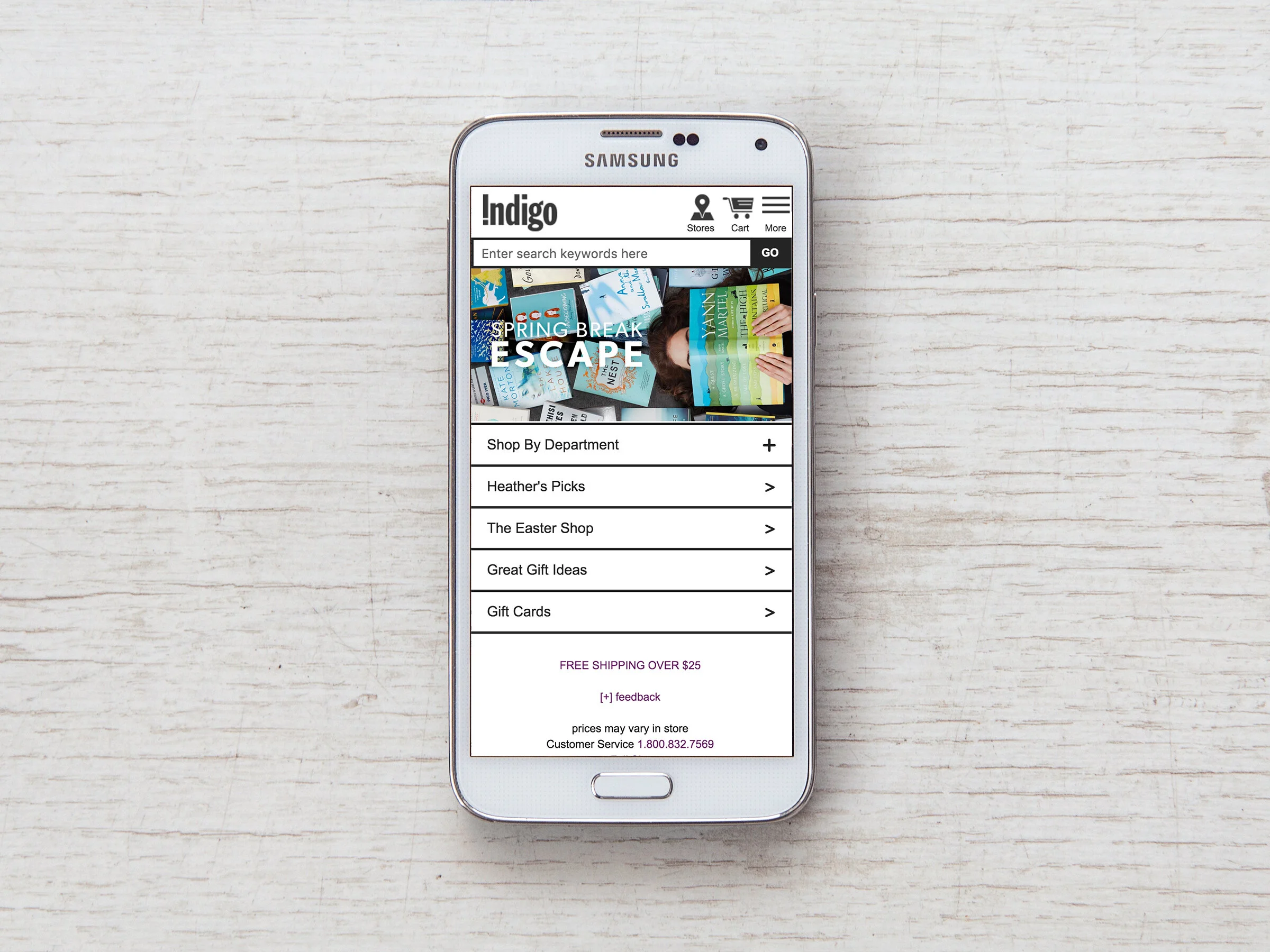
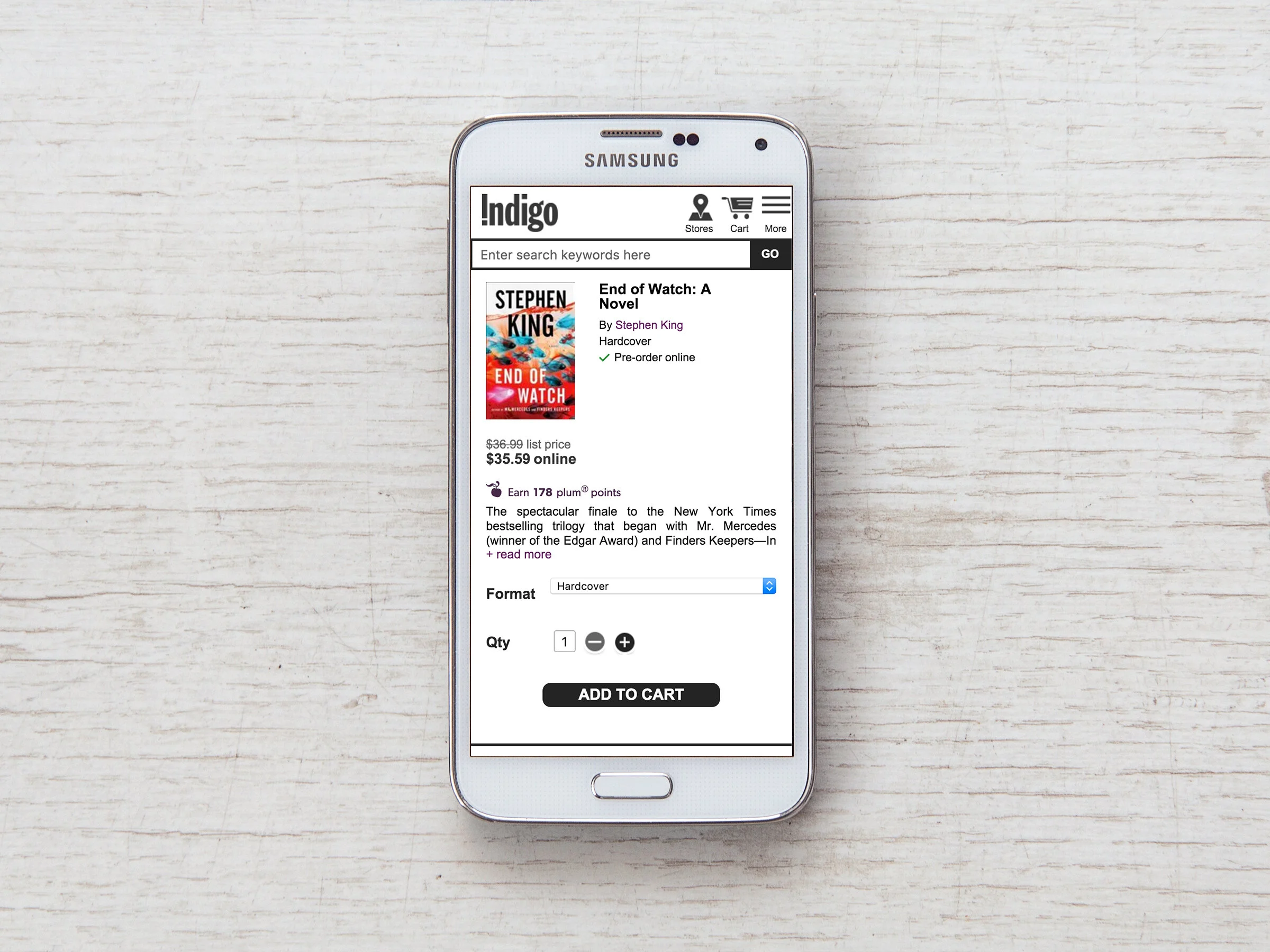
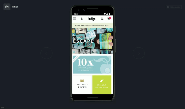
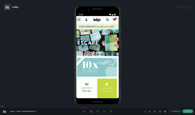
Update the mobile site’s UX and UI to add functionality and provide a more cohesive brand experience.
Research
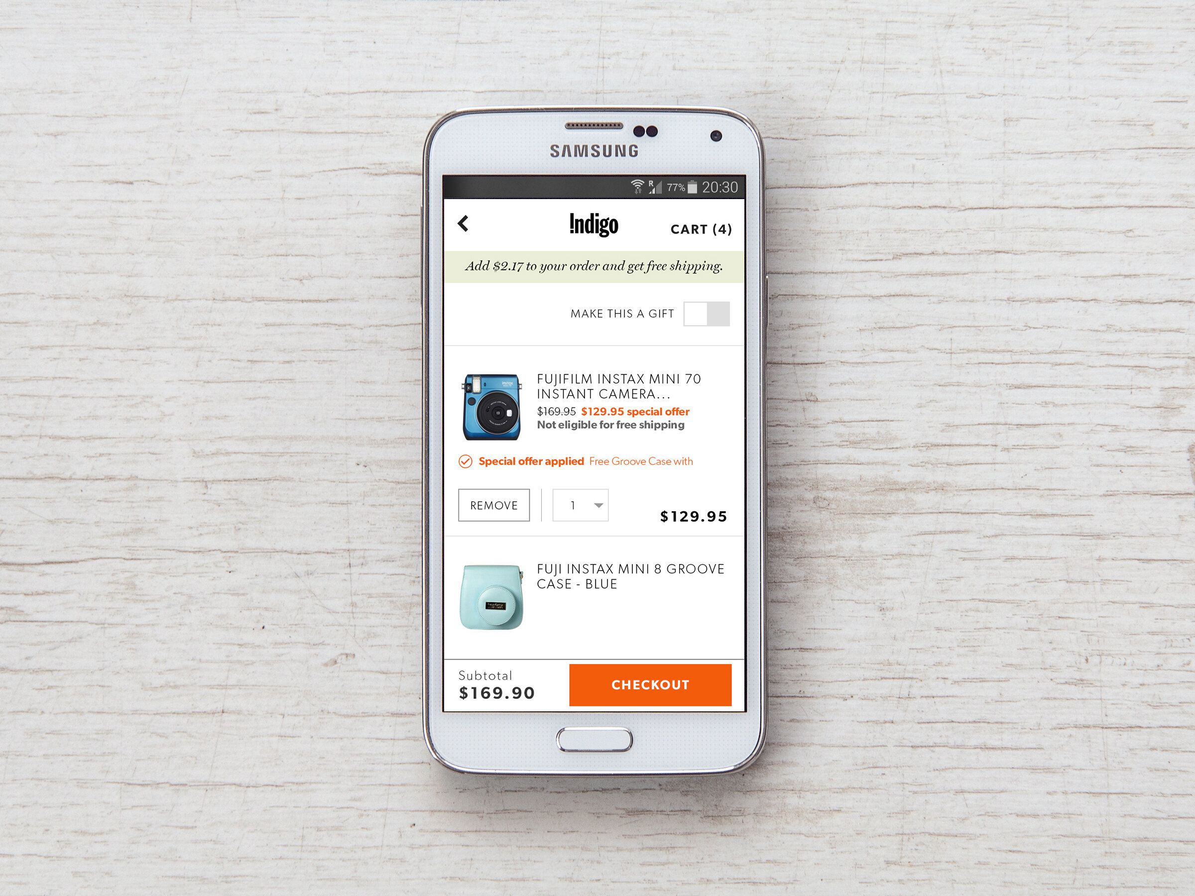
We audited Indigo’s mobile site for differences against the desktop version and compiled a list of potential UI and feature improvements.
Next, we looked at the mobile sites of our retail industry peers, giving us a gauge of interactions and icons users were likely familiar with.
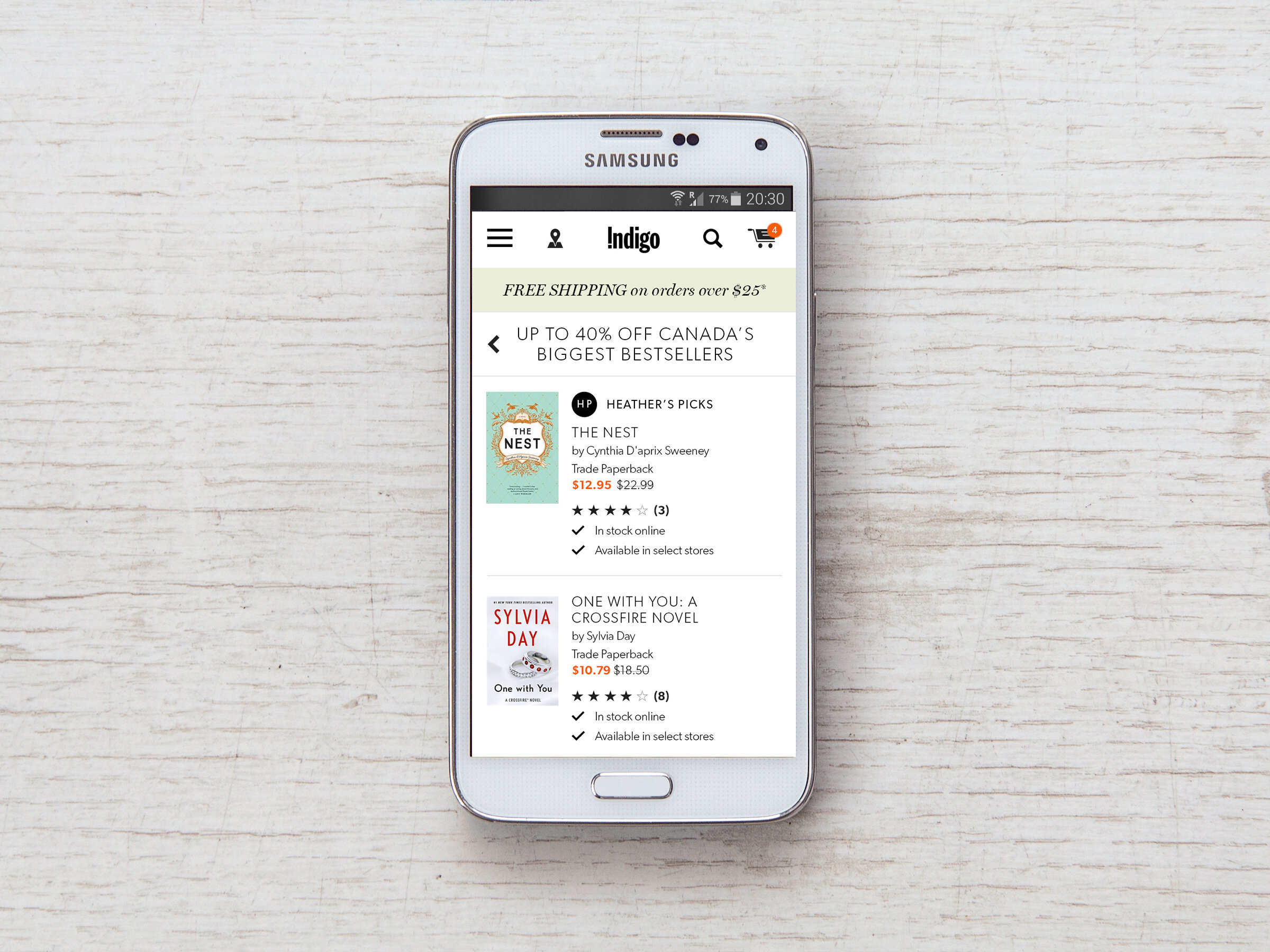
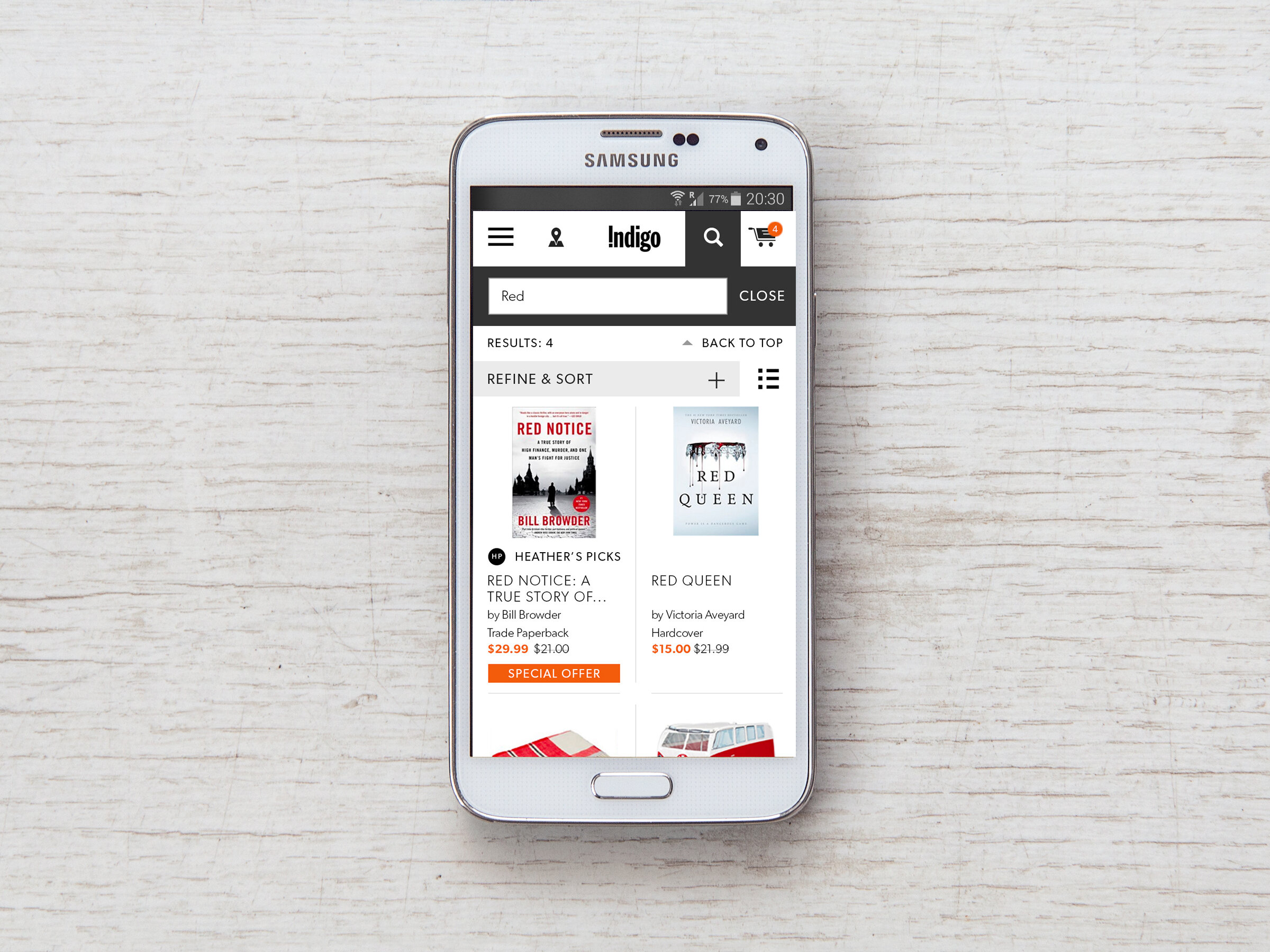
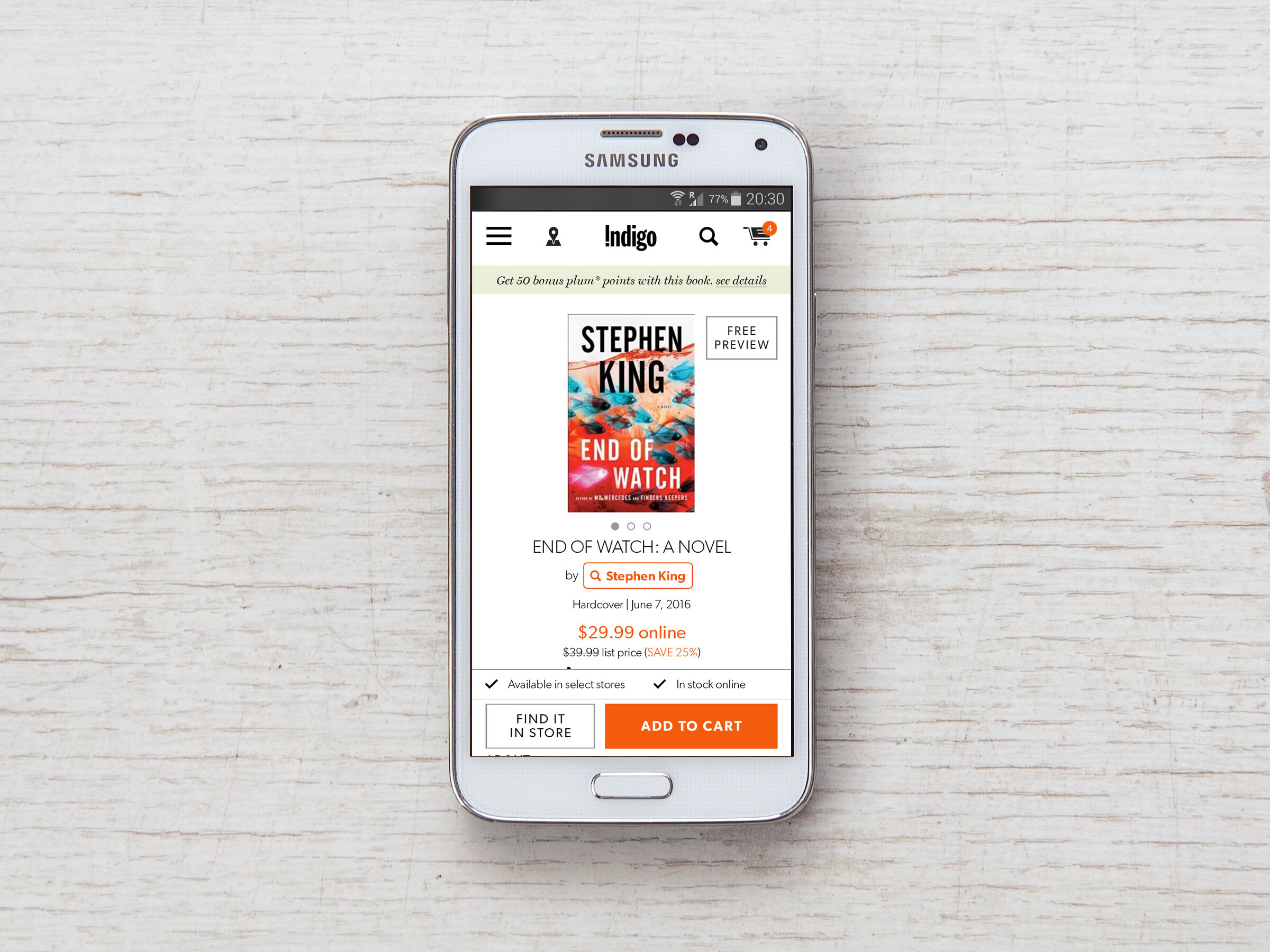
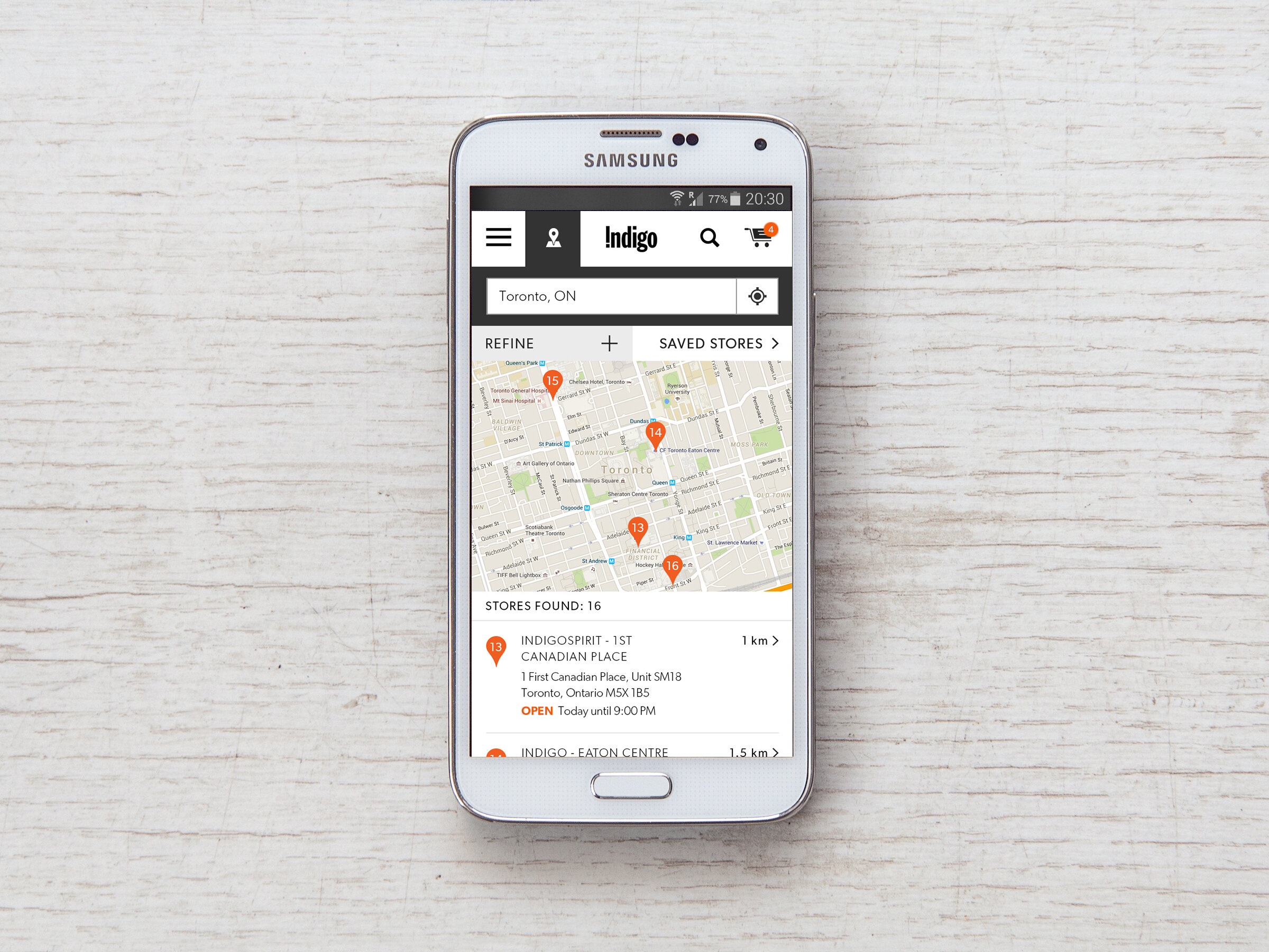
We came up with several features to add, including product availability notices and the ability to save a favourite store location.
Design
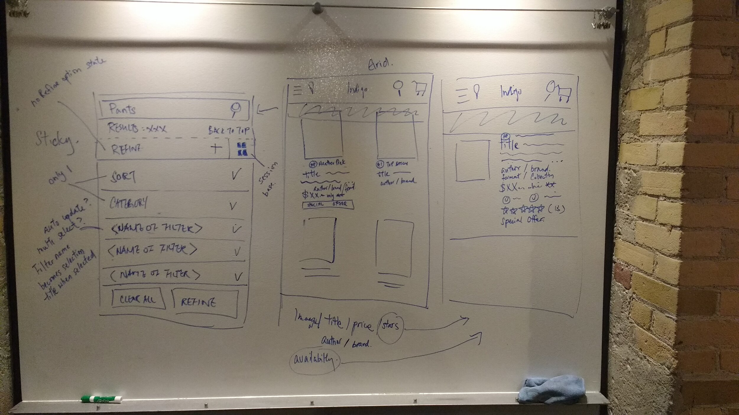
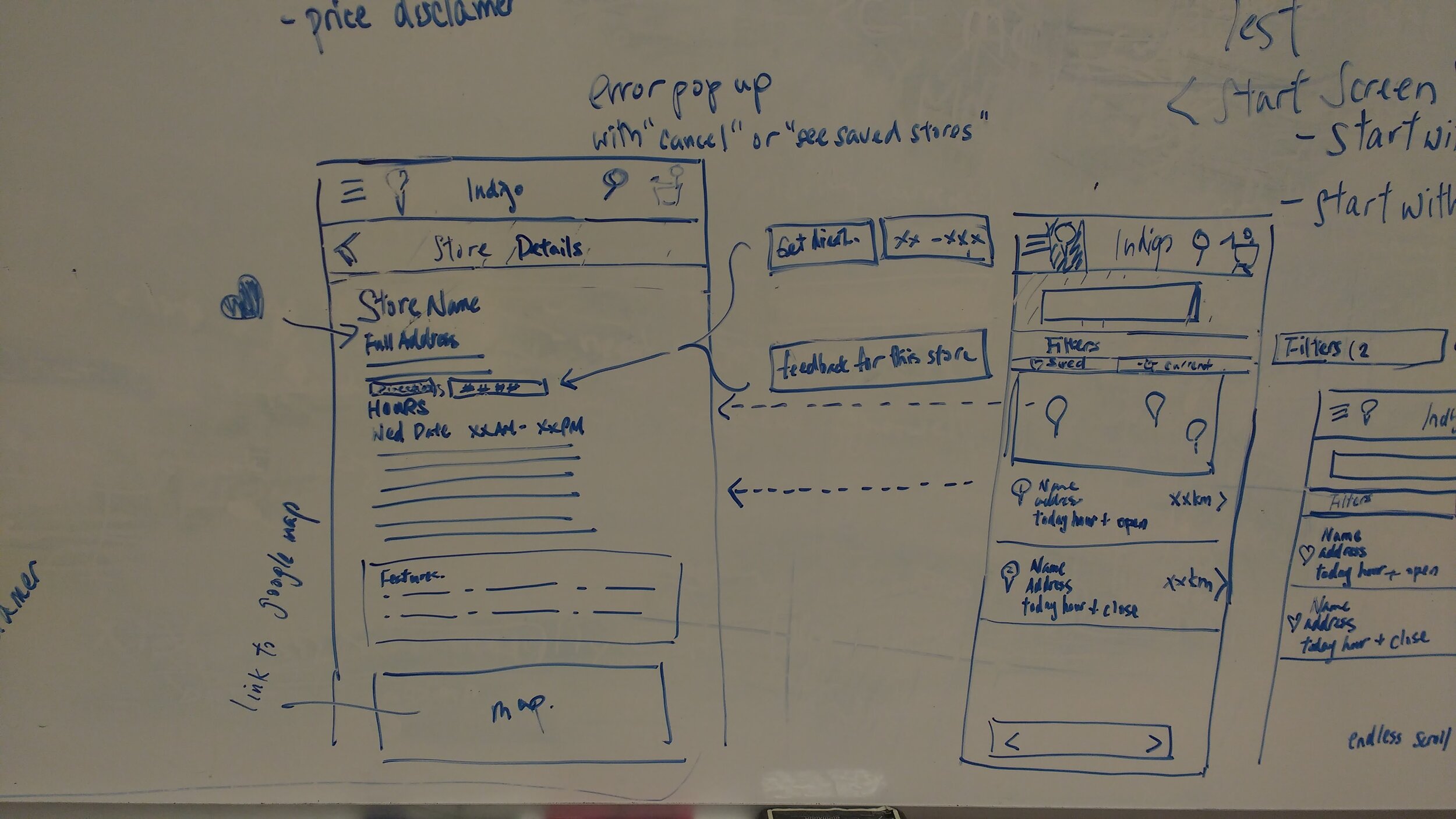
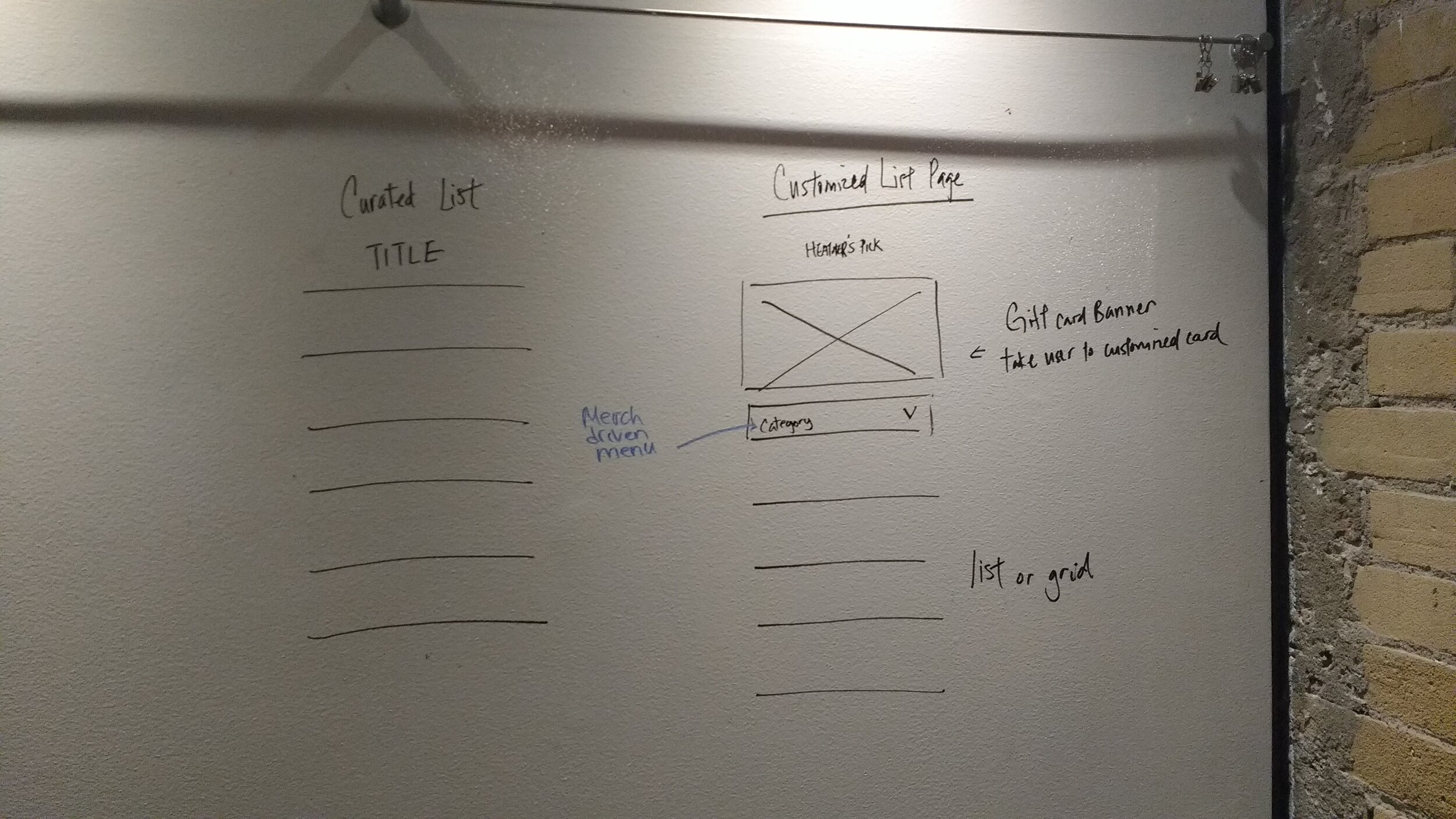
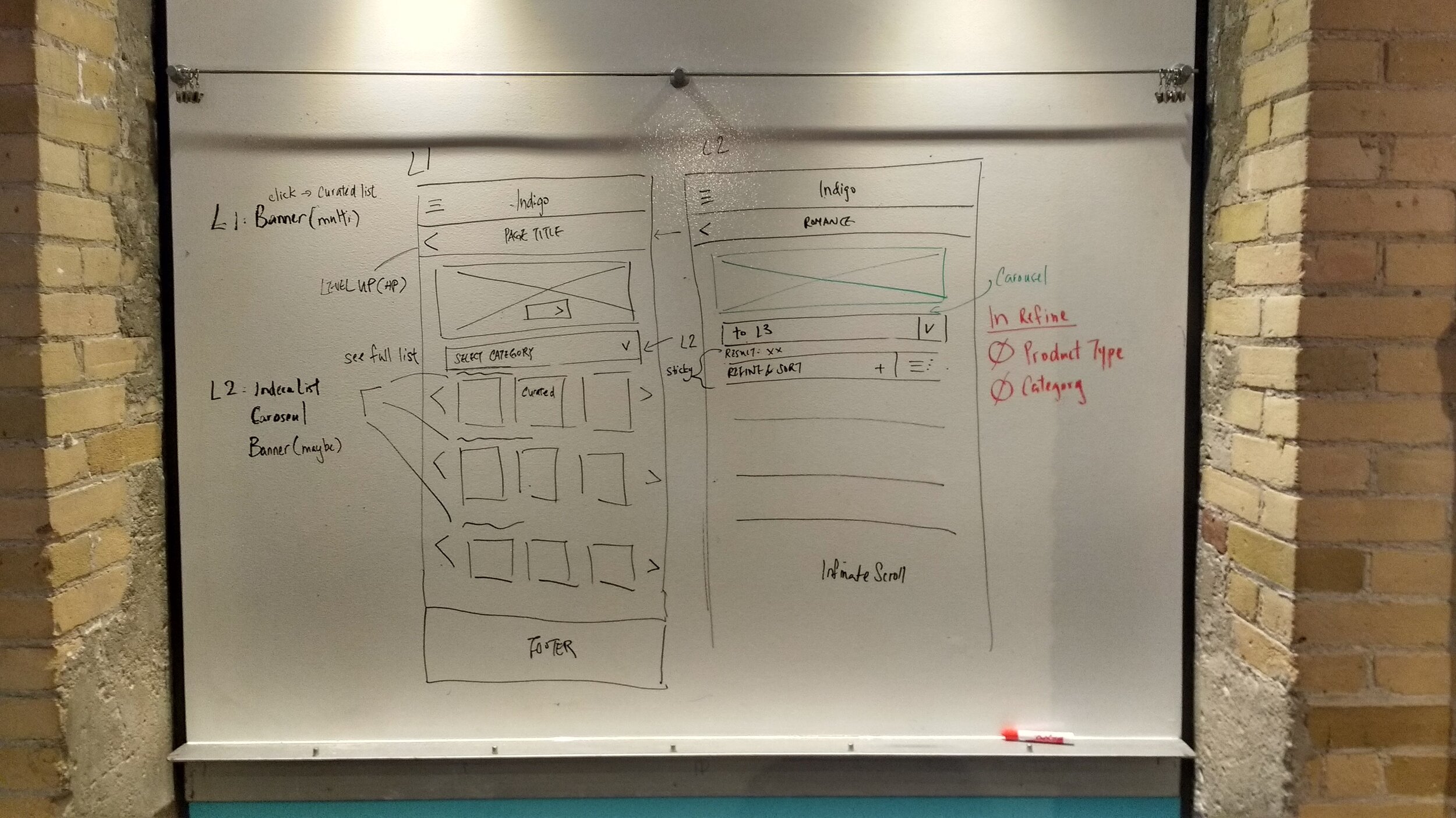
We created each type of mobile site page in individual design sprints.
The team talked through features and ideas to create initial sketches. High-fidelity wireframes, UI and prototypes were developed from those sketches.

Testing
We then ran A/B testing on select features and colours to see what resonated with customers. With testing complete, we reviewed the prototypes with our developers for comments and resolved issues before proceeding to development.
Post-development, we conducted rigorous user-acceptance testing before pushing each phase live.
Result
A new mobile website cohesive with the Indigo brand and improved functionality resulting in a decreased website bounce rate.